App Card
appcard__ideal__icon-outlined-gallery-1__compact
11 views
current
App card with app name, icon and content slots.
View
Size
Exploded 3D
One sheet per visible drawing level. Structural-only
composables are kept in the next sheet's breadcrumb. Rides the SVG link and download.
Locale & text
Overlays
Overrides
Declared overrides — edit a value to re-render.
Compare17 variants of App Card, against FigmaM3 Wear OS Apps Design Kit

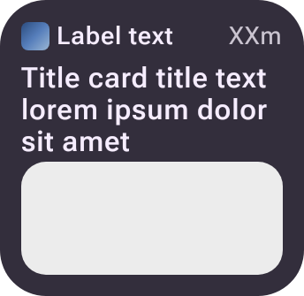
 ideal/content-image/compact79.7%not scoreddiff →
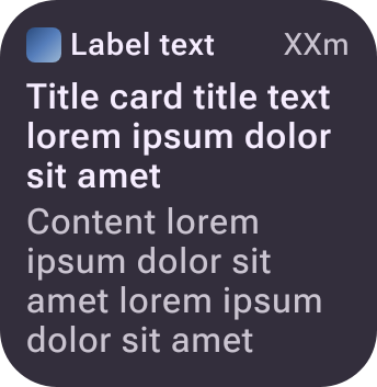
 ideal/default/compact81.0%not scoreddiff →
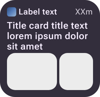
 ideal/gallery-1/compact88.8%not scoreddiff →
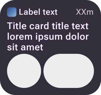
 ideal/gallery-2/compact87.4%not scoreddiff →
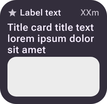
 ideal/icon-content-image/compact80.4%not scoreddiff →
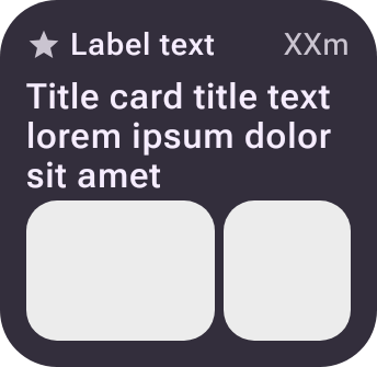
 ideal/icon-gallery-1/compact89.1%not scoreddiff →
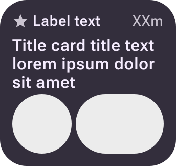
 ideal/icon-gallery-2/compact87.7%not scoreddiff →
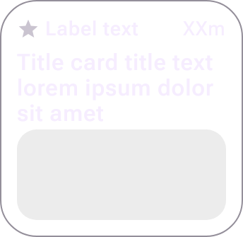
 ideal/icon-outlined-content-image/compact63.9%not scoreddiff →

 ideal/icon-outlined-gallery-1/compacton the stage70.6%not scoreddiff →
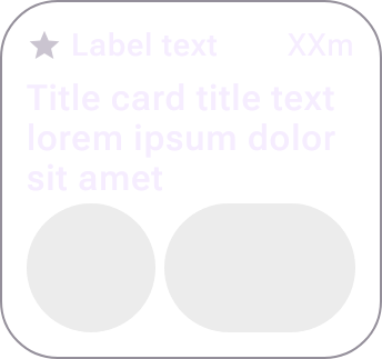
 ideal/icon-outlined-gallery-2/compact68.8%not scoreddiff →
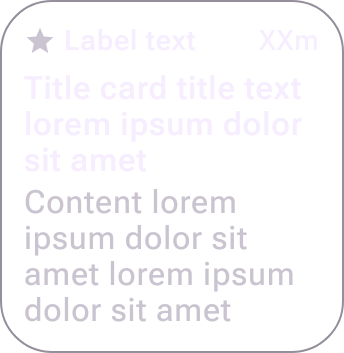
 ideal/icon-outlined/compact75.7%not scoreddiff →
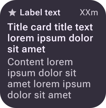
 ideal/icon/compact80.9%not scoreddiff →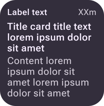
 ideal/no-app-image/compactnot scorednot scored
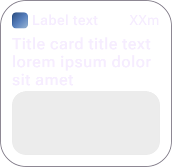
 ideal/outlined-content-image/compact63.3%not scoreddiff →
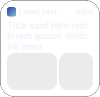
 ideal/outlined-gallery-1/compact69.8%not scoreddiff →
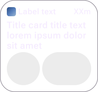
 ideal/outlined-gallery-2/compact68.2%not scoreddiff →
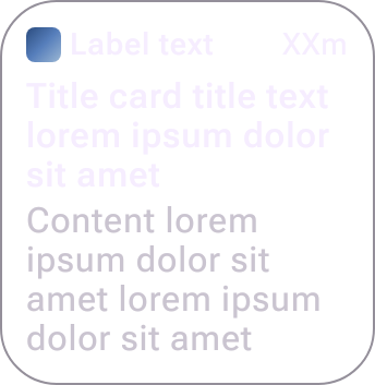
 ideal/outlined/compact75.1%not scoreddiff →