Stepper
stepper__ideal__icon__compact
11 views
current
A value moved a step at a time, between buttons at the top and bottom of the screen, with the level rail the kit draws beside them — a curved progress arc standing in for the level indicator remote-material3 does not publish.
View
Size
Exploded 3D
One sheet per visible drawing level. Structural-only
composables are kept in the next sheet's breadcrumb. Rides the SVG link and download.
Locale & text
Overlays
Overrides
Declared overrides — edit a value to re-render.
Compare8 variants of Stepper, against FigmaM3 Wear OS Apps Design Kit

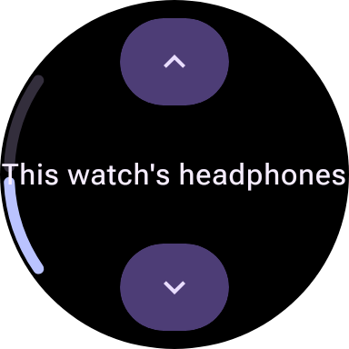
 ideal/default/compact35.3%not scoreddiff →

 ideal/disabled/compact5.1%not scoreddiff →
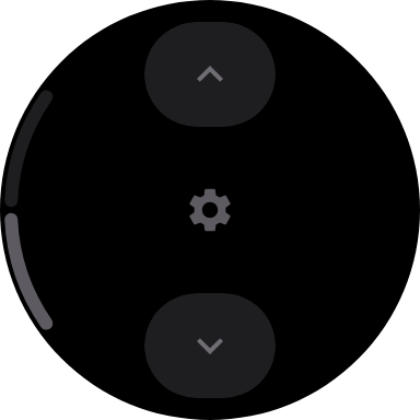
 ideal/icon-disabled/compact5.9%not scoreddiff →
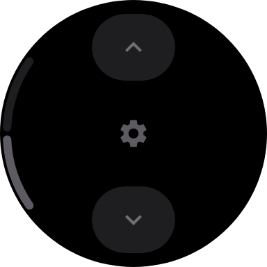
 ideal/icon-no-button-fill-disabled/compact5.9%not scoreddiff →
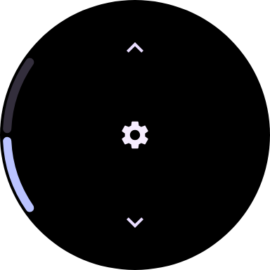
 ideal/icon-no-button-fill/compact12.1%not scoreddiff →
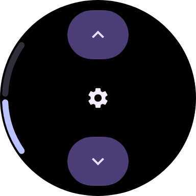
 ideal/icon/compacton the stage32.5%not scoreddiff →

 ideal/no-button-fill-disabled/compact5.1%not scoreddiff →
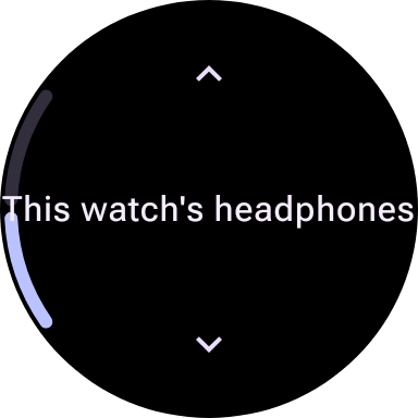
 ideal/no-button-fill/compact10.2%not scoreddiff →